0%

Thoughts

/Design & Product

Design Systems: What Is It?

The shared language that keeps your product from looking like five different products stitched together.

abdulqahar's headshot

Abdulqahar

Product Designer & Design Engineer

4-3-2026
Design Systems: What Is It?

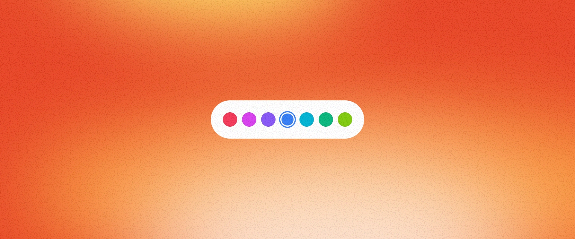
Picture this. You open your company's app and the login button is blue with rounded corners. You navigate to settings and there is a different blue button, this time with square corners. The checkout page has a third button that is sort of blue but also kind of purple.

Someone on the team picked a font for headings six months ago, but three other fonts have crept in since. A new designer joins, builds a feature, and it looks like it belongs to a completely different product.

None of this happened because anyone did bad work. It happened because there was no shared system keeping things consistent. That is the problem a design system solves.

The Basics

So What Is It, Really?

A design system is the single source of truth for how your product looks, feels, and works. Think of it as a rulebook and a toolkit rolled into one. The rulebook captures every design decision your team has made: which colors to use and where, how typography should work, how much space goes between elements, how buttons and forms and cards should look and behave. The toolkit gives you ready-made, reusable pieces so nobody has to rebuild those decisions from scratch every time.

It is not just a Figma file, though there is usually one. It is not just a collection of components, though those are a big part of it. It is the full package: decisions, building blocks, rules, and the documentation that explains all of it.

Think of it as a rulebook and a toolkit rolled into one.

Real-World Examples

They Come in Many Shapes

Different approaches, same goal: making consistency the default, not something you have to fight for.

abdulqahar's headshot

Adobe Spectrum

Powers every Adobe product from Photoshop to Express, keeping them all feeling like one family despite being very different tools.

abdulqahar's headshot

Material Design

Google's system and probably the most recognized in the world. The blueprint that proved design systems could work at massive scale.

abdulqahar's headshot

Untitled UI

A Figma-first system that gives startups and product teams a ready-to-customize foundation so they do not have to start from nothing.

abdulqahar's headshot

HeroUI

Beautifully designed, ready-to-use React components for developers. A developer-first approach to design consistency.

abdulqahar's headshot

KernUI

A clean, well-organized component set built for both designers and developers. Focused and consistent without over-engineering.

Why Does It Matter?

Building a design system takes real effort. So why invest in one?

1. Consistency

When every team pulls from the same set of building blocks and guidelines, the product feels like one product. Users do not have to relearn how things work as they move from one screen to another.

2. Speed

Designers stop recreating the same components over and over. Developers stop guessing how a dropdown should behave. Decisions that used to need a meeting now have a documented answer.

3. Quality

When things like accessibility, responsiveness, and interaction patterns are baked into the building blocks themselves, everything built with those blocks inherits that quality for free. Good design becomes the default, not an afterthought.

4. Scale

A team of three can stay consistent through gut feel. A team of thirty cannot. A design system is what bridges that gap as you grow.

5. Onboarding

Instead of relying on scattered Slack messages and "ask Sarah, she knows," new team members have a clear, documented system to reference from day one.

A team of three can stay consistent through gut feel. A team of thirty needs a system.

The Process

How to Build One

There is no single right way to do this. But there is a sequence that tends to work well, and it starts with understanding what you already have before you design anything new. Tap each step to expand.

01Take Stock of What You Have

Every product, even a young one, already has design decisions baked into it. Someone chose those colors. Someone picked that font. Spacing happened, even if nobody was being deliberate about it.

Before you build anything new, ask: what do we have, what is working, and what is a mess? The answer tells you where your design system should focus first. There is no point designing an elaborate icon set if your typography is inconsistent across every page.

02Run an Audit

An audit is basically an inventory. You go through your product and catalog every unique visual and interaction pattern you can find. Every button variation, every color value, every font size, every spacing choice, every way a form works.

The goal is not to judge. It is to see clearly. Most teams are genuinely shocked when they see the results laid out. Eight different button styles? Fourteen shades of gray? Three completely different approaches to form errors? It is more common than you think.

Once you can see all the inconsistencies in one place, you know exactly what to fix first.

03Set Your Foundations

Foundations are the base-level decisions that everything else is built on: your color palette and how each color is used, your type scale and font choices, your spacing system, your approach to shadows and depth, your icon style, and your layout structure.

These seem like small decisions individually, but they cascade into everything. Getting your spacing system right, for example, can eliminate hundreds of random pixel values scattered across the product.

This is where looking at established systems is really helpful. Adobe Spectrum organizes its colors by purpose and has a type scale that adapts across platforms. Untitled UI provides a complete, ready-to-customize set of styles in Figma. The lesson from both: get your foundations right and the components almost design themselves.

04Create a Naming System for Your Decisions

Here is where things get powerful. Instead of hard-coding a specific blue everywhere (and then having to hunt down every instance when the brand color changes), you give each decision a meaningful name. So your primary brand color is not just "#1A73E8" scattered in twelve places. It is one named value, referenced everywhere. Change it once, and it updates across the entire product.

This naming system works on two levels. At the base level, you define the raw values: specific colors, font names, spacing sizes. On top of that, you create meaningful references: "primary text color," "section gap," "heading font." This layered approach is what lets you update the look and feel of an entire product without touching every screen individually.

Adobe Spectrum is one of the best examples of this done well. Their naming structure is what allows them to power products as visually different as Photoshop and Adobe Express from the same underlying system. HeroUI does something similar on the development side, letting you swap an entire visual identity by updating just a handful of named values. The principle holds: named, reusable values give you control without making the system rigid.

05Build Your Components

With your foundations and naming system in place, you can start building the reusable pieces that teams will actually reach for every day. Buttons, text fields, dropdowns, cards, pop-ups, navigation bars, and so on.

Each component should clearly define what it looks like in every state (default, hover, active, disabled), what variations exist (sizes, styles), and when to use it versus something else ("use a primary button for the main action on the page, secondary for everything else").

Start with the components that show up most often. Your audit will tell you exactly which ones those are. You do not have to build everything at once. A design system is never finished. It grows alongside the product.

Studying existing systems can save you a lot of time here. Untitled UI ships with hundreds of components and page templates organized by category. KernUI demonstrates how to keep things clean and focused without over-building. HeroUI shows what a well-thought-out component structure looks like from the development side.

06Write Instructions People Actually Follow

A pile of components without documentation is just a library. Documentation is what turns it into a system, because it explains the thinking behind each piece: what it is, when to use it, and how to use it correctly. Good docs include examples of what to do and what not to do, written in plain language.

The trick? Put the instructions where people already work. If your engineers live in a component reference tool, put the guidelines there. If your designers live in Figma, build the guidance right into the Figma file. Any documentation that requires a special trip to a separate site will be ignored.

Adobe Spectrum sets a high bar with a dedicated documentation site where every component includes explanations, usage guidelines, and accessibility notes. Untitled UI bakes guidance directly into its Figma files, so designers encounter it naturally while working. Different methods, same principle: meet people where they are.

07Collaboration Is the Culture, Not a Step

A design system built by one person in a corner and handed to the team will not get used. The systems that work are the ones teams build together. Set up a clear process for proposing new components, reviewing changes, and improving what exists. Give people a voice in how the system evolves.

The systems that survive long-term are the ones teams feel ownership over, not obligation toward. People adopt what they helped create.

08Make It Accessible from Day One

Accessibility is not something you sprinkle on at the end. It belongs in the foundations. That means your colors have enough contrast to be readable, your text is legible at every size, your components work with a keyboard (not just a mouse), and your structure makes sense to screen readers.

When accessibility is built into the system's building blocks, every feature built with those blocks is accessible by default. That is so much more effective than catching problems late and scrambling to patch them.

Adobe Spectrum builds accessibility into every component by default, with detailed guidance on how each one should work for keyboard users and screen readers. HeroUI does the same on the development side, handling focus management and keyboard navigation behind the scenes. When it is part of the building blocks, it scales automatically with every new feature.

09Track Whether It Is Working

How do you know if your design system is actually helping? You measure it.

How many teams are using the system versus building one-off solutions? What percentage of your product is built with system components? Are teams shipping faster than they were before? Are there fewer visual inconsistencies? Are design-related bugs going down?

Pick a few numbers that match the reason you built the system in the first place and check them regularly. These numbers also help you make the case for continued investment when leadership wants to know what the system is actually delivering.

10Keep It from Drifting

Without someone keeping an eye on things, a design system slowly falls apart. Components get customized in ways that break the rules. People override decisions because it is faster. Documentation goes stale. And eventually you are right back where you started.

Governance sounds heavy, but it does not have to be. A small team with clear ownership, a simple process for proposing and approving changes, and a regular habit of reviewing and updating the system is enough. The goal is not red tape. It is making sure the system stays useful and trustworthy over time.

Start with the audit. Set your foundations. Build what you need, document it well, and keep going.

The Takeaway

A design system is not a weekend project, and it is never truly done. It grows and evolves alongside the product it serves. But even a small, focused version pays dividends almost immediately.

The goal is not perfection. It is a shared foundation that lets your team spend less time debating which shade of blue to use and more time solving the problems that actually matter to your users.

Build the system. Free up the thinking.

Written by Abdulqahar · Product Designer & Design Engineer · April 2026

Design SystemsProduct DesignDesign EngineeringProcess