process log
Heyyyy! I'm building a design system for humans and AI.
A multibrand fintech token system. Most systems are built to be read by someone who already knows how they work. Hand them to an AI and it picks wrong, confidently, every time. Token names like bg-white-0 mean nothing out of context.
So every token name should encode the decision. Every description should answer what this is for, what it isn't, and what it sits next to.
This is the live log - every decision, every wrong turn, every thing I changed my mind about.
System state
Built to be read correctly by both designers and AI tools.
Auditing existing design systems
Before building anything, measure what exists
Audited a handful of free and paid design systems - Untitled UI, Kern UI, Align UI, Hero UI - running their primitive palettes through a programmatic OKLCH analysis. The goal wasn't to criticise any one system. It was to find the failure modes that look fine in Figma but break down in real component usage and in dark mode.
- 25.7-point lightness spread at step 500 across hues - Blue at L=55.5, Yellow at L=81.2. Same step, completely different visual weight.
- 24.8° hue drift on the neutral scale - shifts from cool-cyan at light steps to blue-violet at dark steps.
- Light-end compression on yellow, teal, green - steps 50-200 nearly indistinguishable in practice.
- Dark mode surfaces lose hue differentiation - all hues converge at steps 800-950 making color-coded cards look identical.
- Used Tailwind v4 primitives as the starting point. Custom OKLCH-calibrated scales deferred to v2.1.
Primitive color layer
225 raw values. Zero semantic meaning.
- 9 chromatic hues x 11 steps + 3 alpha tokens each = 126 vars
- 9 gray families x 11 steps = 99 vars - neutral, slate, gray, zinc, stone, taupe, mauve, mist, olive
- OKLCH reference string on every variable. Source: Tailwind v4.
- Merged chromatic + gray families into one collection
01 · Color Primitives- both are raw values, same usage rule (never bind from components directly), no reason to split.
Alias layers - brand and gray swap
Mode-based swapping with no component re-binding required
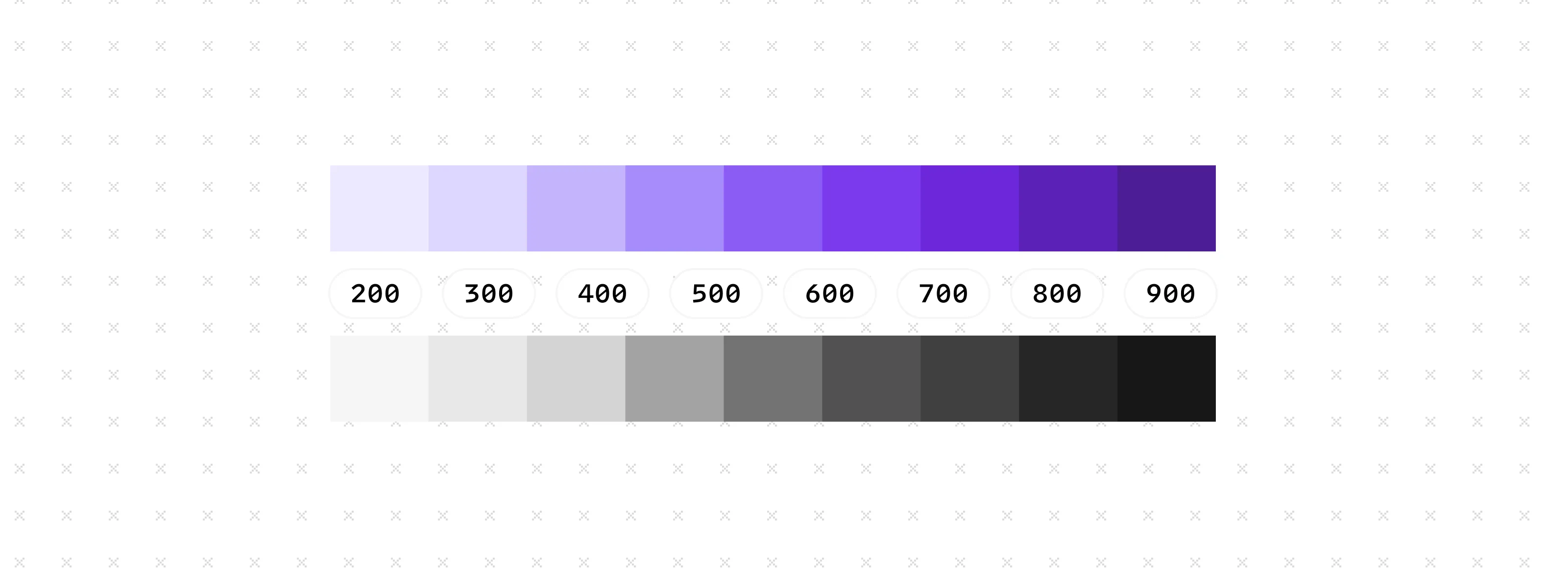
02 · Active Gray- 11 tokens, 4 modes. Each mode aliases into a gray family in Color Primitives.03 · Theme- 14 tokens, 4 modes. Each mode aliases into a chromatic hue in Color Primitives.- Chose mode-based over collection-based swapping. A Brand - Purple + Brand - Active wrapper was built first and discarded - required explaining two-collection indirection to every designer. Mode switch is one action.
- 4-mode cap on Professional plan is an accepted constraint at current scale.
First semantic attempt - torn down
Three structural problems found mid-build
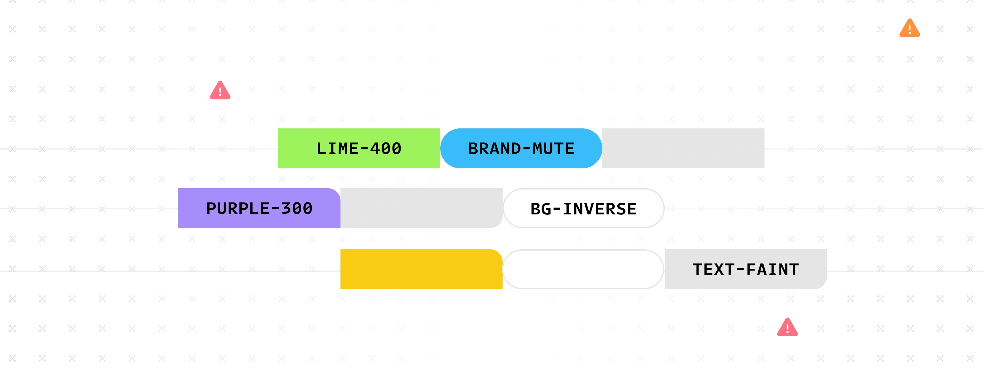
- Brand tokens existed in three places simultaneously - Component Tokens, Brand - Purple, Brand - Active. Nothing referenced Brand - Active.
background/primary/faint- "primary" adds nothing. No secondary exists. Pure noise in every name.- "Component Tokens" as a collection name - surface tokens apply to page layouts too, not just components.
content/*covered both text and icon fills - Figma requiresTEXT_FILLvsALL_FILLSscopes separately. One token can't correctly serve both.- Rebuilt from scratch. Patching in place would leave naming inconsistencies that AI tools would misroute forever.
Naming convention
Group / Role / Appearance / State - names that encode the decision
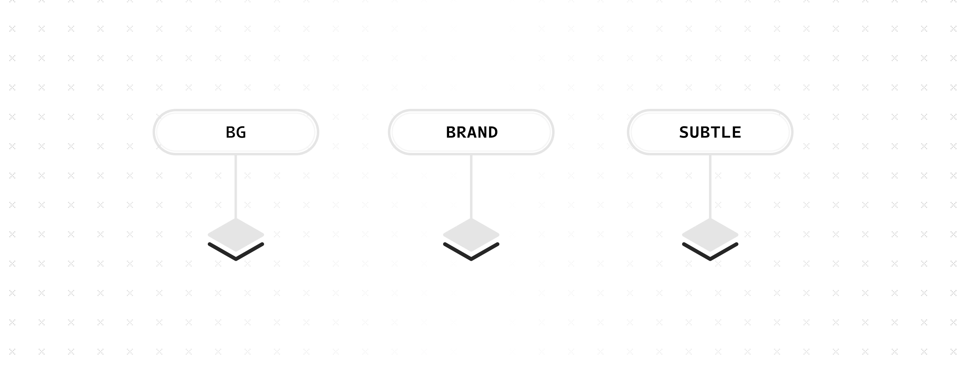
- Four-axis convention: Group (background · text · border · icon) / Role (surface · brand · negative · success · warning...) / Appearance (bold · subtle · muted · faint · inverse) / State (hover · pressed · selected · disabled · focus)
- Chose
surfaceas role for neutral tokens. Considered: "primary" (redundant - no secondary), "neutral" (collides with neutral state in State collection), no qualifier (ambiguous). Surface is descriptive and unique.
Semantic - Surface
54 tokens covering every component color need
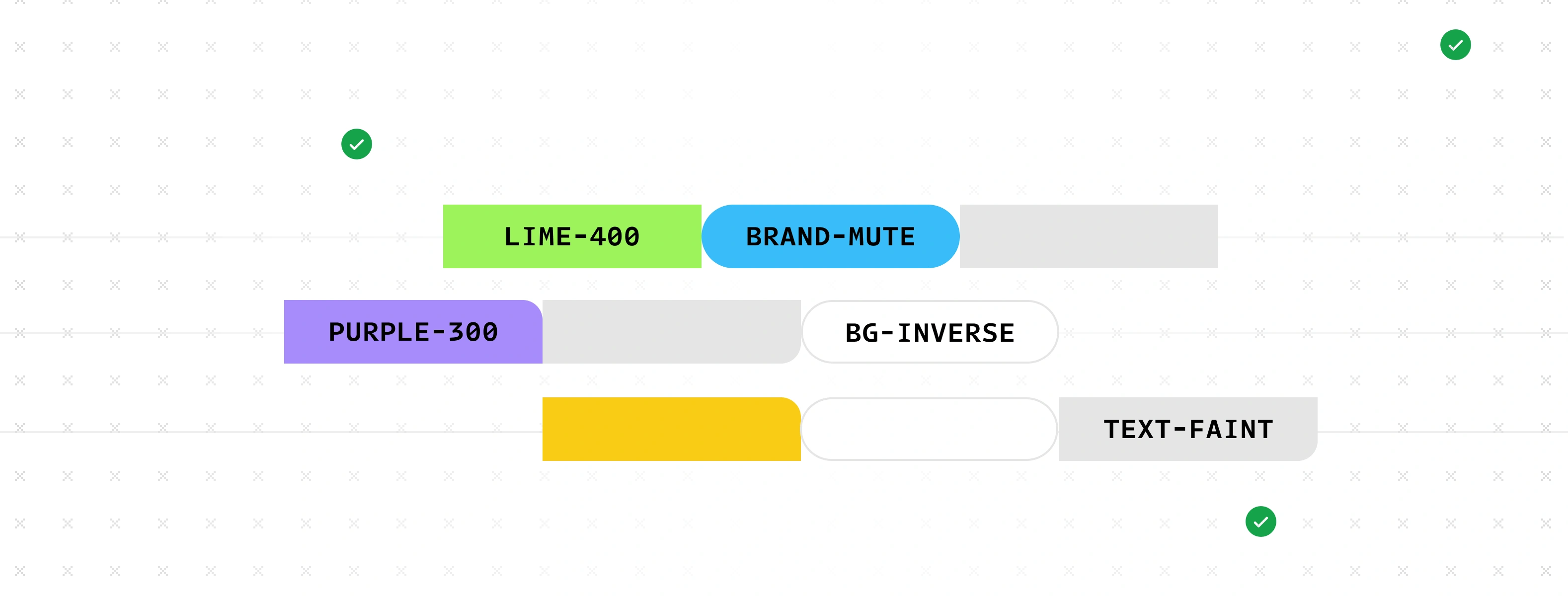
- background/surface/* - faint · subtle · muted · bold · inverse (5 tokens)
- background/brand/* - bold · subtle · muted · inverse (4 tokens)
- text/surface/* · text/brand/* · text/link/* - 9 tokens
- border/surface/* · border/brand/* - 9 tokens
- icon/surface/* · icon/brand/* - 9 tokens
- All interaction states - hover · pressed · selected · disabled · focus for surface and brand (18 tokens)
- Every token carries structured description:
USE / NOT / PAIR / EXAMPLE / alias - Merged surface + interaction tokens into one collection - a designer building a button needs both simultaneously. Separation was a build artifact, not an architectural decision.
Content/* -> Text/* + Icon/*
Splitting a v1.4 assumption that was always wrong

- v1.4
content/*covered both text and icon fills with a single token per role text/*- TEXT_FILL scope.icon/*- ALL_FILLS scope. 20 content tokens -> 30 tokens.- Exceptions:
text/surface/muted(placeholder - text only),text/link/*(text only) - Clean break, not a deprecation path. Mixed v1/v2 conventions are harder to explain to AI tools than a clear cut with a migration map.
Semantic - State
128 tokens - 8 states x 4 groups x 4 appearances
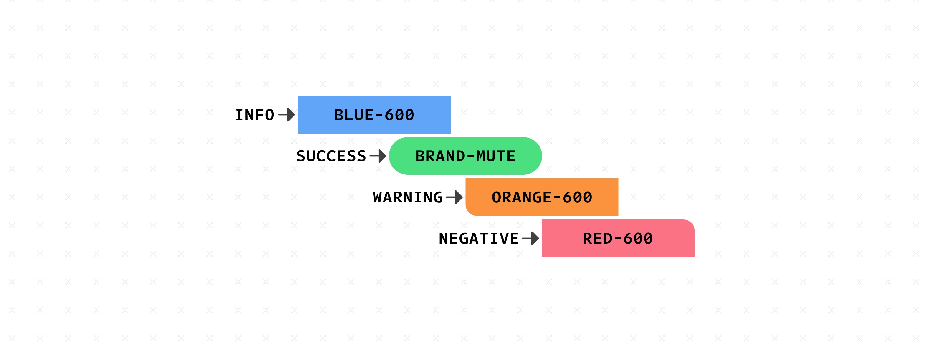
- 8 states x 4 groups (background / text / border / icon) x 4 appearances (bold · subtle · muted · faint) = 128 tokens
- State tokens point directly to Color Primitives - unaffected by Theme or Active Gray mode changes
- Named
negativenoterror- error implies a technical failure. In fintech the red state covers overdrawn balances, declined payments, destructive confirmations. Negative is semantically broader.
Base group - tokens that never move
Guaranteed white, black, transparent - regardless of mode or gray family
- 9 base tokens. Both modes resolve to the same absolute value - never inverts.
- Use cases: bank card renders, payment receipts, partner logo containers, document previews - real-world white surfaces that must not invert in dark mode.
background/surface/faintis near-white and inverts.background/base/whiteis #ffffff always. Different jobs, different tokens.
System audit
Programmatic check across 428 variables
- 0 broken alias references across all collections
- 256 state aliases correctly pointing to Color Primitives
- 36 brand tokens -> Theme · 52 neutral tokens -> Active Gray - all correct
- 225 Color Primitive vars have empty scopes - appear in all pickers. Config issue, deferred.
- 7 Radius sharp mode values missing. Deferred.
space/0missing value. Deferred.- Config issues don't affect token resolution or alias chains. Fixed before first component build.
Collection map
What binds where and why
| 01 · Color Primitives | All raw values. 9 chromatic + 9 gray families. Never bind from components directly. | 225 · Value |
| 02 · Active Gray | Gray swap lever. Switch mode on frame to change gray family. | 11 · 4 modes |
| 03 · Theme | Brand swap lever. Switch mode on frame to change brand color. | 14 · 4 modes |
| 04 · Semantic - Surface | Primary component binding. background / text / border / icon - surface + brand + all interaction states. | 54 · Light/Dark |
| 05 · Semantic - State | Status and feedback. 8 states x 4 groups x 4 appearances. | 128 · Light/Dark |
Stable principles
Binding rules
- -Neutral surface → 04 · Semantic - Surface
- -Status/feedback → 05 · Semantic - State
- -Interaction states → 04 · Semantic - Surface
- -Never bind → 01 · Color Primitives
- -Never bind → 02 or 03 (swap levers)
Swap mechanism
- -Brand color → switch 03 · Theme mode
- -Gray family → switch 02 · Active Gray mode
- -Light / Dark → switch 04 + 05 mode
- -Add brand → new mode in 03 · Theme
- -Add gray → new mode in 02 · Active Gray
Naming convention
- -Group / Role / Appearance / State
- -No role = surface (neutral)
- -No state = resting
- -surface ≠ neutral (state)
- -base = absolute, never inverts
AI consumption
- -Name encodes the decision
- -USE / NOT / PAIR / EXAMPLE on every token
- -No token needs description to be correct
- -Scopes restrict to correct picker contexts